Wilderkind is the 2026 aesthetic for people who are tired of nature aesthetics that make nature look comfortable.
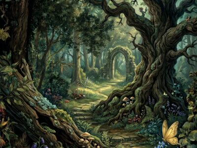
Pinterest Predicts named it one of the defining trends of 2026. The name combines “wilder” and “kind” — wild kindred, wild child — and the aesthetic reflects this: nature as raw force rather than pastoral backdrop. Not threatening nature, not domesticated nature. Untamed nature, in full presence.
Wilderkind aesthetic (Pinterest Predicts 2026) celebrates raw, untamed wild nature — not cultivated, not arranged, not softened. Core palette: raw earth (#8A6A3A), wild grass green (#6A7A3A), storm grey (#5A5A52), and slate (#3A3A38). Different from cottagecore (pastoral, domestic) and ethereal forest (soft, muted). For digital creatives: wild nature botanical seamless pattern sets and untamed wilderness digital paper bundles on Creative Fabrica.
What Is Wilderkind Aesthetic?
Wilderkind is defined by wildness — specifically, the quality of being outside of human management. The plants grow where they grow. The landscape looks the way it looks without intervention. The aesthetic celebrates unmediated nature.
This produces specific visual characteristics:
- Vigorous, unpredictable growth: Plants growing at odd angles, into each other, out of cracks. The aesthetic resists neat arrangements and formal botanical compositions.
- Weather exposure: The aesthetic includes the effects of weather — wind-bent grasses, storm-light landscapes, rain on stone. The environment has been through things.
- Raw earth: Soil, rock, root systems, the underside of things. The Wilderkind aesthetic is as interested in what is at ground level as what is above it.
- Absence of cultivation: No gardens, no planted botanical borders, no arranged displays. The plants in Wilderkind aesthetics arrived themselves.
The distinction from cottagecore: cottagecore is pastoral domesticity — gardens, cottages, bread. Wilderkind has no cottage. The absence of the domestic is definitive. The comparison to Mystic Outlands: Outlands is ancient and atmospheric; Wilderkind is present and immediate. Outlands is landscape-scale; Wilderkind is ground-level, material, tactile.
Wilderkind is what nature looks like when it has not been asked to perform for anyone. The grass goes where the wind tells it.
How Does Wilderkind Differ from Cottagecore?
The comparison is useful because the two aesthetics are often confused — both involve natural elements and earthy palettes.
The fundamental difference is agency. In cottagecore, the human presence is central — the cottage, the garden, the bread, the lace. The natural elements are domesticated and curated. In Wilderkind, there is no human presence — or if there is one, it is peripheral. The natural elements are primary and uncurated.
Secondary differences:
- Palette: Cottagecore is warm and pastoral (lavender, dusty rose, warm cream). Wilderkind is raw and earthy (raw earth, wild grass green, storm grey).
- Motifs: Cottagecore — florals, mushrooms, herbs, cottage windows. Wilderkind — wild grasses, bracken, exposed rock, seed heads in wind, exposed root systems.
- Scale: Cottagecore is intimate, interior-adjacent. Wilderkind is landscape-scale, exposed-environment scale.
Browse Wilderkind Botanical Resources →
What Is the Wilderkind Colour Palette and Textures?
The palette is earthier and less saturated than dark nature, greener and less refined than cottagecore.
- Raw earth (#8A6A3A): The primary warm tone. Bare soil, exposed earth, brown bracken. This is the colour of things before they become anything else.
- Wild grass green (#6A7A3A): The botanical anchor. Not forest green, not sage — the specific yellow-green of wild grasses in summer turning into autumn. Variable — some plants are more yellow, some more grey, all within this approximate range.
- Storm grey (#5A5A52): The atmospheric note. Appears in rock faces, in overcast sky, in the grey that settles on landscape in variable weather. Not blue-grey, not warm grey — neutral grey with a slight green undertone.
- Slate (#3A3A38): The darkest value. Ancient stone, deep shadow at ground level, the colour of wet rock. Near-black but cooler and more mineral.
How to Apply Wilderkind in Your Creative Work?
The aesthetic suits nature-observation projects — field journals, botanical sketchbooks, nature photography companion volumes, and seasonal observation records. It suits outdoor and landscape contexts more than interior-focused journals.
Applications that work well:
- Field journals: Wild botanical papers as backgrounds for observation notes and sketches. The untamed quality of the papers suits note-taking alongside nature rather than presentation-mode journaling.
- Seasonal observation: The Wilderkind palette changes visibly across seasons — the wild grass green of summer, the raw earth of autumn, the storm grey of winter. A seasonal journal project in this aesthetic can track the palette shift across the year.
- POD products: Tote bags, notebooks, and clothing in the Wilderkind palette and wild botanical patterns. The raw earth and wild grass green combination works well on natural cotton and linen substrates.
For the larger-scale, more atmospheric end of the 2026 nature trend pair, see our Mystic Outlands aesthetic guide — both are Pinterest Predicts 2026 trends but from different angles on wildness.
Browse All Wilderkind Resources on Creative Fabrica →
Frequently Asked Questions
What is Wilderkind aesthetic?
Wilderkind is a 2026 Pinterest trend celebrating raw, untamed wild nature — plants growing without management, exposed earth and rock, storm-light landscapes, the immediate physical presence of the natural world without domestication or arrangement. It is defined by the absence of the human domestic — no cottages, no gardens, no cultivated elements.
How does Wilderkind differ from cottagecore?
Cottagecore is pastoral domesticity — the cottage, the garden, the bread, the lace. Human presence is central and the natural elements are curated and domesticated. Wilderkind has no cottage — the absence of the domestic is definitive. The natural elements are primary, uncurated, and exist independently of human management.
What colours define Wilderkind aesthetic?
Raw earth (#8A6A3A), wild grass green (#6A7A3A), storm grey (#5A5A52), and slate (#3A3A38). The palette is earthier and more variable than dark nature aesthetic and cooler and less refined than cottagecore. The yellow-green quality of wild grass green is the most distinctive colour choice — it distinguishes Wilderkind from the deeper greens of forest aesthetics.
Where to find Wilderkind digital resources for creative projects?
Creative Fabrica — search “wild nature botanical pattern”, “wildflower herb clipart”, “earthy wild nature paper”, “untamed botanical seamless”, and “dark wild grass pattern”. The free plan covers basics; All Access opens the full range. Files are instant download with commercial licence for POD, journaling, and craft use.
Key Takeaways
- Wilderkind is defined by the absence of human domestication — the plants grew themselves, the landscape has not been managed; this distinguishes it clearly from cottagecore and all cultivated garden aesthetics
- Wild grass green (#6A7A3A) — yellow-green, variable, the colour of wild grasses in seasonal change — is the most distinctive and characteristic colour of this aesthetic
- Field journals, seasonal observation records, and outdoor nature journals are the most natural journaling applications — the aesthetic suits note-taking alongside nature rather than interior-presentation journals
- Wilderkind and Mystic Outlands are the twin Pinterest 2026 nature trends — Wilderkind is immediate and ground-level, Outlands is ancient and landscape-scale; together they define the dominant nature aesthetic direction for 2026