Fairy grunge is the collision of two things that have no business being together and work perfectly: raw, damaged texture and fairy-tale forest imagery.
The fairy element brings wings, night-blooming flowers, and ancient forest. The grunge element brings scratch marks, cracked surfaces, heavy grain, and the visual language of things that have been through something. The combination produces an aesthetic that is simultaneously delicate and abrasive — the torn fairy wing on the distressed background is the whole visual argument in one image.
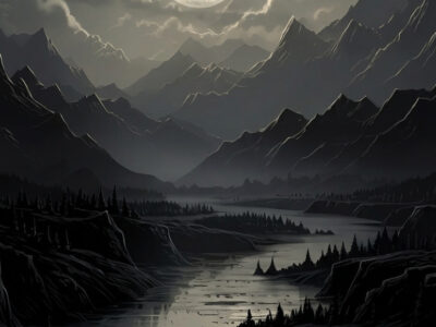
Fairy grunge aesthetic combines dark fantasy forest imagery with raw, distressed texture — dirty purples, forest greens, near-black, with grunge grain, scratch marks, and abrasive visual elements over delicate fairy-tale botanical motifs. A niche but growing aesthetic in journaling and art journals. Digital resources: dark fairy botanical patterns and grunge texture digital papers on Creative Fabrica.
What Is Fairy Grunge Aesthetic?
Fairy grunge occupies a specific position in the aesthetic spectrum: it is darker than enchanted forest, more delicate than dark punk, and more fantasy-inflected than dark cottagecore. The balance is deliberate and specific.
The fairy element provides: wing imagery (moth wings and fairy wings in preference to butterfly), night-blooming flowers (dark florals, not garden flowers), ancient forest (twisted trees, dense canopy, fern-covered ground), and a sense of fragile, aged magic.
The grunge element provides: heavy texture grain (visible, coarse, not subtle), scratch marks and damage overlays, paper distress effects, the visual language of surfaces that have been exposed to weather and time. The grunge should look accidental, not applied.
The collision of these two elements is the aesthetic. A clean fairy-tale botanical is not fairy grunge. A clean grunge texture is not fairy grunge. Both must be present and both must be visible.
Fairy grunge is the aesthetic of something magical that has survived something difficult. The magic is intact. The surface is not.
What Are the Visual Elements — Dark Fantasy Meets Raw Texture?
The visual vocabulary in two registers:
Fantasy botanical elements: Twisted ancient trees, moth wings at varying scales, dark-toned night-blooming flowers (deep purple, near-black roses, dark petals), mushrooms at fantastical scale, forest floor ground cover (ferns, moss, lichen), ivy on distressed surfaces.
Grunge texture elements: Heavy grain overlays at 40–70% opacity, scratch and damage marks as design elements (not as errors), distressed paper surfaces (torn edges, irregular marks), cracked texture overlays, faded and aged colour treatment over brighter botanical elements.
The challenge in building this aesthetic is calibrating the two registers. Too much grunge and the fantasy disappears. Too much fantasy and the grunge reads as just a filter. The workable ratio is roughly 60% fantasy botanical, 40% grunge texture — but this varies significantly by application.
Browse Fairy Grunge Patterns on Creative Fabrica →
What Is the Fairy Grunge Colour Palette?
The palette sits in a specific zone: cool enough to be dark fantasy, warm enough to not be cold goth.
- Dirty purple (#4A2A5E): The primary fantasy note — but desaturated, muddied slightly with brown. Not bright purple, not clean indigo. This quality of being between-colours is central to the aesthetic.
- Forest green (#2A4A2A): The botanical anchor. Darker than enchanted forest, less saturated than dark forest. Appears in foliage, in ground cover, as the environmental colour.
- Near-black (#1A1A18): The backdrop and deepest shadow. Warmer than pure black.
- Rust brown (#6A3A1A): The grunge note. Appears in aged paper areas, in worn edge details, in the colour of things that have oxidised. This is what keeps the palette from being purely fantasy.
How Is Fairy Grunge Used in Journaling and Art Projects?
The aesthetic is most at home in art journals rather than planning or bullet journals — the visual noise of the grunge texture does not accommodate functional content (habit trackers, to-do lists) well. It is a purely visual aesthetic for pages that are about looking at rather than writing in.
Applications that work:
- Art journal spreads: Full-page visual compositions combining grunge background papers with dark fairy botanical clipart. The more visual the spread, the more effectively the aesthetic reads.
- Zine pages: The fairy grunge aesthetic suits small-format publication design — the raw texture and dark fantasy imagery works well at zine scale where precision is not expected.
- Book cover designs: Dark fantasy book covers and notebook covers. The aesthetic carries very well to physical product surfaces.
For the adjacent darker and simpler fairy aesthetic, our dark fairycore guide covers resources for the enchanted-forest fairy approach without the grunge element.
Browse All Fairy Grunge Resources on Creative Fabrica →
Frequently Asked Questions
What is fairy grunge aesthetic?
Fairy grunge is the collision of dark fantasy forest imagery with raw, distressed grunge texture — delicate botanical and fairy-tale elements combined with scratch marks, heavy grain, and aged distress effects. The aesthetic is defined by visual contradiction: fragile fairy-tale motifs on abrasive, damaged surfaces. It is a niche but growing aesthetic in art journaling and dark fantasy design.
What colours define fairy grunge aesthetic?
Dirty purple (#4A2A5E), forest green (#2A4A2A), near-black (#1A1A18), and rust brown (#6A3A1A). The palette is intentionally muddied — purples are desaturated and brownish, greens are dark and restrained, and the rust note is the grunge register’s colour signature. Avoid clean, saturated colours.
What type of journaling suits fairy grunge aesthetic?
Art journals — purely visual, layout-focused spreads rather than functional planning or writing journals. The grunge texture does not accommodate dense handwritten content well. The aesthetic suits pages designed to be looked at rather than written in.
Where can I find fairy grunge digital papers and patterns?
Creative Fabrica — search “dark fairy botanical pattern”, “grunge texture dark floral”, “dark purple grunge paper”, and “forest fantasy clipart dark”. The free plan covers basics; All Access opens the full range. Files download instantly with commercial licence.
Key Takeaways
- Fairy grunge requires both elements present simultaneously — clean fantasy botanical is not fairy grunge, clean grunge texture is not fairy grunge; the visual contradiction is the whole aesthetic
- The workable ratio is approximately 60% fantasy botanical, 40% grunge texture — too much grunge and the fantasy disappears, too much fantasy and the grunge reads as just a filter effect
- Art journals are the primary application — the grunge texture does not accommodate functional journaling content; this is a purely visual aesthetic
- Dirty, muddied purple (#4A2A5E) rather than saturated violet is the distinguishing colour choice — it is this desaturation that places the aesthetic in grunge rather than pure dark fantasy