Not all dark academia digital papers read as nature. Not all nature digital papers read as academic. The ones that do both simultaneously are the useful ones.
The dark academia nature pattern is a specific combination: sepia botanical illustration, aged paper texture, and just enough scholarly mark-making (annotations, fine-line borders, map fragments) to signal the academic register. Finding that combination at commercial licence quality takes more searching than it should.
The best dark academia nature patterns for journaling combine sepia botanical illustration with aged paper texture and scholarly mark-making elements. Top styles: aged parchment botanical papers, engraving-style botanical seamless patterns, and dark academia nature bundles combining leaves, books, and botanical motifs. Available on Creative Fabrica — search “dark academia botanical”, “botanical parchment paper”, and “aged botanical seamless”.
What Makes a Strong Dark Academia Nature Pattern?
Three qualities distinguish the useful patterns from the generic ones:
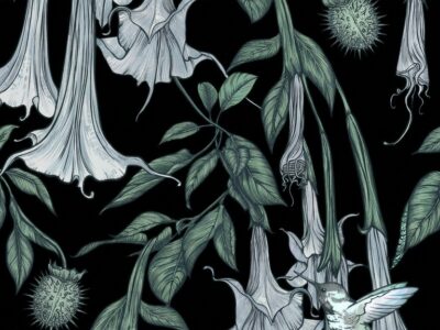
Illustration quality. The botanical elements should look studied, not decorative. Engraving-style line work, visible leaf veining, identifiable plant structures. A generic leaf silhouette reads as decoration. A precisely rendered fern frond with visible spore structures reads as dark academia nature.
Palette restraint. The pattern should stay in the sepia-parchment-deep moss range. Any bright colour, any modern flat design, any oversaturated hue immediately exits the aesthetic. The test: desaturate the pattern 50%. If it still reads as beautiful and coherent, it is probably in the right range.
Age indicators. The pattern should look like it has existed for some time. Foxing marks, yellowed paper tones, ink that has faded slightly at the edges, paper that has been folded. These signals are not decoration — they are the substance of the aesthetic.
A dark academia nature pattern should look like it was made by someone who was not thinking about aesthetics. They were thinking about the plant.
What Are the Top Seamless Pattern Styles for Dark Academia Nature Journaling?
In order of versatility for journaling applications:
- Aged parchment botanical: The foundational style. Aged paper base with botanical illustration overlay at 60–80% opacity. The paper texture is primary; the botanical illustration is secondary. This is the most versatile for multi-page journaling because it works at any scale.
- Engraving-style botanical seamless: Fine-line ink botanical at repeat, on aged or dark background. Higher detail density than the parchment style. Better for covers and single-page backgrounds than for spread backgrounds — too much detail competes with additional content on the page.
- Dark academia hybrid (botanical + book motifs): Seamless pattern combining leaves, quill or book elements, and botanical illustration in one repeat. Less botanically precise but more recognisably dark academia in its dual-motif vocabulary. Best for POD and notebook covers.
- Moss and parchment minimal: Very low-density botanical elements on aged parchment — widely spaced motifs, lots of background visible. The minimal version. Useful when the spread content is rich and needs a light background to avoid visual noise.
Browse Dark Academia Nature Papers on Creative Fabrica →
How to Use Dark Academia Nature Digital Papers in Your Journal?
Three approaches, in order of complexity:
Single-paper spreads: Use one aged parchment botanical paper as the full-page background. Add handwritten content in dark ink over it. No additional layering needed. This is the fastest approach and often the most effective — the paper does enough work on its own.
Two-layer spreads: Aged parchment base layer, botanical clipart element or engraving illustration at full opacity in one corner or margin. The botanical element anchors the spread while the parchment provides the writing surface. Requires matching the illustration style to the paper style — both should reference the same era and quality of scholarly work.
Layered collage spreads: Multiple papers at different opacities, botanical illustration at medium opacity, map fragment or manuscript page element as an under-layer, handwritten content over all of it. The most complex approach — reserve for spread pages that are primarily visual rather than functional journaling pages.
How to Pair Dark Academia Nature Patterns with Fonts and Stickers?
The pattern is the background system — everything layered on top needs to maintain the aesthetic’s period-observation quality.
Fonts that work: Serif fonts with visible ink variation (not perfect digital uniformity), handwriting fonts that look like actual handwriting rather than calligraphy performance, monospace fonts referencing typewriter. Avoid: any sans-serif, any modern script, anything with visible digital precision.
Stickers and elements that work: Pressed botanical prints, small ink stamps with naturalist motifs, wax seals in dark wax, torn-edge paper borders, simple fine-line illustrations with annotation labels. Avoid: die-cut shapes with bright colours, modern clip art, any sticker that looks designed for a recent market.
The pairing rule: If the sticker or font looks like it was made after 1980, it probably breaks the aesthetic. The test is not the year it was actually made — it is whether it reads as belonging to the scholarly naturalist tradition.
For additional inspiration on the botanical pattern range, our forest witch aesthetic guide covers related resources at the darker end of botanical illustration.
Browse All Dark Academia Nature Patterns →
Frequently Asked Questions
What makes a good dark academia nature digital paper?
Three qualities: botanical illustration precision (engraving or ink study style, not decorative florals), palette restraint (sepia, aged parchment, deep moss only), and age indicators (foxing marks, yellowed tones, faded ink edges). A pattern that has all three works for dark academia nature journaling. Missing any one and it becomes something adjacent but distinct.
What fonts pair with dark academia nature digital papers?
Serif fonts with visible ink variation, handwriting fonts that look like actual handwriting rather than calligraphy performance, and monospace typewriter-referencing fonts. Avoid sans-serif, modern script, and any font that reads as designed after 1980. The test is whether the font looks like it belongs to the scholarly naturalist tradition.
Where can I download dark academia nature patterns for journaling?
Creative Fabrica — search “dark academia botanical”, “aged botanical seamless”, “botanical parchment paper”, “sepia botanical paper pack”, and “dark academia journal cover”. The free plan covers a good selection; All Access opens the full range. Files are instant download with commercial licence.
How many papers do I need for a complete dark academia nature journal project?
A pack of 8–12 sheets covering the full range (minimal aged parchment to dense engraving-style botanical) is sufficient for a 20+ page journal project if the palette is consistent across the pack. The key is palette consistency — papers from different packs with different sepia interpretations will clash at page turns even if each individual paper looks correct in isolation.
Key Takeaways
- The three qualities that distinguish useful dark academia nature patterns: botanical illustration precision, palette restraint (sepia-parchment-deep moss), and age indicators — a pattern missing any one of these reads as something adjacent but not quite right
- For multi-page journal projects, buy one pack of 8–12 sheets in the same sepia palette rather than mixing packs — palette inconsistency between packs is the most common visual problem in dark academia nature journals
- Font pairing rule: if the font looks designed after 1980, it probably breaks the aesthetic — the font needs to read as belonging to the scholarly naturalist tradition
- Low-density minimal botanical papers are underused for this aesthetic — when spread content is rich, a dense pattern background competes; a minimal botanical parchment paper gives the content room to breathe