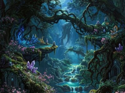
You know that moment just before the forest wakes up — when light sits in the canopy like smoke and everything is the colour of old paper? That is the ethereal forest aesthetic, held still.
It is not dark forest. It is not cottagecore. It is the space between — pale, soft, gold-lit, and deeply particular about saturation levels. Most mood boards get it wrong by going too rich. The real thing stays quiet.
This guide covers the visual language in detail, how to apply it in creative projects, and the digital resources that actually embody it — not just approximate it.
Ethereal forest aesthetic is a soft, mist-toned visual style built on pale greens, dusty golds, and translucent whites — think early morning light filtered through old-growth canopy. The signature palette runs at low saturation (15–35%), distinguishing it from darker forest aesthetics. It appears most in journaling spreads, scrapbook layouts, digital paper packs, and botanical clipart designed for an airy, otherworldly mood.
What Sets Ethereal Forest Aesthetic Apart?
The defining characteristic is restraint. Where dark forest goes deep and moody, ethereal forest pulls everything back — lighter, hazier, more suspended in time.
The reference point is not a dense canopy. It is the edge of the forest at dawn: translucent ferns catching low light, silver birch trunks, a single moth resting on pale bark. Nothing saturated. Nothing sharp.
The ethereal forest aesthetic lives at 20% saturation. Push past 40% and you have left it entirely.
Adjacent aesthetics that often get confused with it: cottagecore (warmer, more pastoral, less mysterious), dark forest (much deeper value range, intentionally moody), and fairycore (more iridescent, more fantasy). Ethereal forest sits to the left of all of them on the saturation scale.
What Does the Colour Palette Actually Look Like?
Four anchor colours carry the whole aesthetic. Everything else orbits around them.
- #C8D5B9 — sage mist. The dominant mid-tone. Appears in foliage, backgrounds, digital paper washes.
- #F5EFD7 — pale gold. The warmth note. Used sparingly: highlights, text accents, stamens, candlelight details.
- #E8E8E0 — soft white. The negative space colour. Not a pure white — it has warmth baked in.
- #2A3A2A — deep moss. The darkest value used. Appears in fine ink lines, branch silhouettes, never as background fill.
Texture matters as much as colour. The aesthetic relies on soft grain, watercolour blooms, and translucent washes — not clean vectors, not flat fills. If the design has crisp hard edges and full opacity, it is not ethereal forest.
A practical test: desaturate your reference image. If it still reads as beautiful, you are probably in the right territory. If it loses all interest, the original was relying on colour to carry weight it cannot.
Each file below is a ready-to-download digital paper or pattern — open in Photoshop, Procreate, or print directly for journal covers and scrapbook pages. Commercial licence included on Creative Fabrica, so you can use these in products you sell. Instant download.
Browse Ethereal Forest Digital Papers →
How to Use This Aesthetic in Journaling Spreads?
The ethereal forest aesthetic is particularly well-suited to journaling because it rewards layering. A single digital paper as a background, two or three clipart elements placed deliberately, and pale gold ink for text — that combination is enough.
The mistake most people make is crowding. This aesthetic needs space. Leave 40% of the page as the background colour showing through. If every inch is covered, you have lost the misty quality that defines it.
Specific pairings that work well in spreads:
- Sage mist digital paper base + single large fern frond in the upper corner + fine-line text in deep moss
- Aged parchment background (not cream — aged) + scattered seed pod clipart at low opacity + pale gold washi tape border
- Translucent white wash layer over a sage base to simulate morning fog — achieved by placing a semi-opaque white rectangle before adding botanical elements
How Does Ethereal Forest Work in Interior Decor?
The aesthetic translates well to physical spaces because its palette works with neutral walls and natural materials. It does not require repainting anything.
The most effective applications:
- Wall prints: A4 or letter-size botanical prints in the sage and pale gold range. Framed in thin natural wood. The scale matters — small clusters of three prints work better than a single large statement piece for this aesthetic.
- Textiles: Linen cushion covers in sage mist, throw blankets in soft white with a single embroidered fern. The texture of linen carries the softness the aesthetic needs.
- Desk and shelf styling: Dried botanicals (not fresh — too saturated), aged paper, small glass vessels. The keyword is found object, not purchased decoration.
For printable wall art in this style, the digital paper packs on Creative Fabrica double effectively — printed at A3 on matte paper, they read as proper wall art. The matte finish is non-negotiable. Gloss kills the haze.
Where to Find Digital Resources for Ethereal Forest Creative Projects?
The challenge with this aesthetic is that generic searches return too much. “Forest pattern” on most platforms surfaces dark, saturated, photographic results — the opposite of what you need.
The searches that consistently return the right material:
- watercolour forest digital paper — filters to hand-rendered, low-contrast results
- misty botanical pattern — the word “misty” does most of the filtering work
- translucent fern clipart — specifically surfaces the right opacity range
- pale forest seamless pattern — removes the dark variants from results
Creative Fabrica is the most reliable source for this aesthetic at commercial licence quality — the free plan gives access to a solid base of botanical and forest digital papers that fit the palette without adjustment. For more specificity (the exactly right shade of sage, a particular illustration style), the All Access plan opens a significantly wider range.
Looking for more options? Our enchanted forest digital paper guide covers fairytale-adjacent resources, and our dark forest aesthetic guide shows what happens when you push the saturation further.
Browse All Ethereal Forest Resources on Creative Fabrica →
Frequently Asked Questions
What colours are used in the ethereal forest aesthetic?
The core palette centres on sage mist (#C8D5B9), pale gold (#F5EFD7), soft white (#E8E8E0), and deep moss (#2A3A2A) used only as a fine-line detail colour. Saturation stays below 35% throughout — any higher and the aesthetic shifts into dark forest or cottagecore territory.
How does ethereal forest aesthetic differ from dark forest aesthetic?
The primary difference is saturation and value range. Dark forest aesthetic works with deep, rich colours — dark greens, near-black shadows, high contrast. Ethereal forest stays in a narrow light-to-mid value range with minimal contrast. Both use botanical motifs, but the mood is entirely different: dark forest is intentionally moody, ethereal forest is soft and suspended.
Can I use ethereal forest digital papers for commercial projects?
Yes — most digital papers on Creative Fabrica include a commercial licence, meaning you can use them in products you sell (journals, scrapbook kits, POD items). Always check the individual product licence; the free plan and All Access plan both cover commercial use for most listings.
Is ethereal forest aesthetic the same as Mystic Outlands from Pinterest Predicts 2026?
Related, but not identical. Mystic Outlands (a Pinterest Predicts 2026 trend) is broader — it encompasses ancient wilderness, otherworldly landscapes, and remote environments. Ethereal forest is a more specific subset: indoor-applicable, craft-oriented, and centred on the soft botanical and forest visual language rather than the dramatic landscape imagery of Mystic Outlands.
What is the best software for applying ethereal forest digital papers in journaling?
Procreate (iPad) is the most flexible — the layer blending modes give you precise control over opacity and wash effects that define this aesthetic. Photoshop works equally well for more complex layered spreads. For simpler journaling layouts without layering, Canva handles the basics; set the background image and place clipart elements on top at reduced opacity using the transparency slider.
Key Takeaways
- Ethereal forest aesthetic is defined by low saturation (15–35% range) — the most common mistake is pushing colours too rich and landing in dark forest territory instead
- The four-colour palette — sage mist, pale gold, soft white, deep moss — is the structural foundation; all other colours are derived from these
- For journaling applications, leave 40% of the page as visible background; crowding the spread destroys the misty quality the aesthetic depends on
- Digital papers and botanical clipart from Creative Fabrica’s free plan cover this aesthetic well — for exact palette matching, the All Access plan opens a wider range of options